It’s getting hot in here
Toronto weather data from 2013 through 2018
Anthony Ionno
June 30, 2018
Summary
It is hot in Toronto right now. Like 45 degrees Celsius hot.
So, I thought I would do a short post that looks at daily weather patterns in Toronto. Both the graphs below show that since 2013 we are seeing a higher frequency of daily average temperature above zero degrees Celsius than below in Toronto.
Analysis
Data
The raw data used in this analysis is available on the Environment Canada website. The processed version of this data is available on my github page. The data spans from June 13, 2013 to June 27, 2018 and contains 1,819 records of temperature data for Toronto Pearson International Airport.
R libraries
The following libraries were loaded into my R workspace for this analysis. I also define a custom ggplot2 theme for both the data visualizations below.
# Loading libraries and user defined functions
library(tidyverse);library(magrittr); library(extrafont); library(extrafontdb)
library(ggplot2); library(viridis);library(DT)

theme_ai <- function(){
  theme_minimal() +
    theme(
      text = element_text(family = "Segoe UI", color = "gray25"),
      plot.title = element_text(size=22),
      plot.subtitle = element_text(size = 20),
      axis.text = element_text(size=18, color = "gray25"),
      axis.title = element_text(size = 20),
      plot.caption = element_text(color = "gray30", size=16),
      plot.background = element_rect(fill = "gray95"),
      plot.margin = unit(c(5, 10, 5, 10), units = "mm"),
      #axis.line = element_line(color="gray50")
      axis.ticks.x = element_line(color="gray35"),
      panel.grid.major.y = element_line(colour = "gray80"),
      legend.position = "none")

}
Preprocessing
6 weather data files were read into the R workspace. One variable was formatted to another type, a date variable, and new variable was created to contain the daily maximum or minimum weather in a given day. Several variables were stripped from the dataset prior to being read into R.
file_list <- list.files()
file_list <- file_list[c(5,7:11)]
df_name_list <- c("w_2018", "w_2013", "w_2014", "w_2015", "w_2016",
                  "w_2017")

for(i in 1:length(file_list)){
  assign(df_name_list[i], read.csv(paste(file_list[i])))
}
# Had some sort of issue with the 2017 file
w_2017 <- read.csv('eng-daily-01012017-12312017.csv')
var_list <- names(w_2018)
df_list <- ls()[grep("w_",ls())]
for(i in 1:length(df_list)){
  assign(df_list[i],select(get(df_list[i]),var_list)%>%
           mutate(Date=as.Date(Date.Time, format = "%Y-%m-%d")))
}
w_2018 <- w_2018 %>%
  mutate(Date = as.Date(Date.Time, format = "%m/%d/%Y"))
w_all <- rbind(w_2013, w_2014, w_2015, w_2016, w_2017, w_2018)
w_all <- w_all[complete.cases(w_all),]
w_all <- w_all %>%
  mutate(max_temp = ifelse(abs(Min.Temp...C.) > abs(Max.Temp...C.),Min.Temp...C.,
                           Max.Temp...C.),
         temp_count = ifelse( Mean.Temp...C. > 0, 1, 0))
Results
The data visualizations below contain either daily average or maximum temperature for a given day from June 13, 2013 to June 27, 2018. The grey lines for both data visualizations represent smoothed local average means and show that, on average, daily average and maximum temperature is increasing over time. The data table below contains all the information used for this analysis.
# Daily Average Temp.
w_all %>%
ggplot()+
  geom_col(aes(x = Date, y = Mean.Temp...C., fill = Mean.Temp...C.<0),alpha=.7)+
  stat_smooth(aes(x = Date, y = Mean.Temp...C.),alpha = .7, se = FALSE, color = "gray55")+
  #stat_smooth(aes(x = Date, y = Max.Temp...C.))+
  #stat_smooth(aes(x = Date, y = Min.Temp...C.))+
  theme_ai()+
  scale_x_date(date_breaks = "3 month", date_labels = "%y-%m")+
  scale_y_continuous(breaks = seq(-20,40,10))+
  scale_fill_manual(values = c("seagreen3","royalblue3"))+
  labs( x = "Date (YY-MM)", y = "Average Temp. in °C",
        title = "Daily average temperature in Toronto from 2013 through 2018",
        subtitle = "Toronto international aiport weather station used in all years",
        caption = "Data Source: Environment Canada | Creation: Anthony Ionno")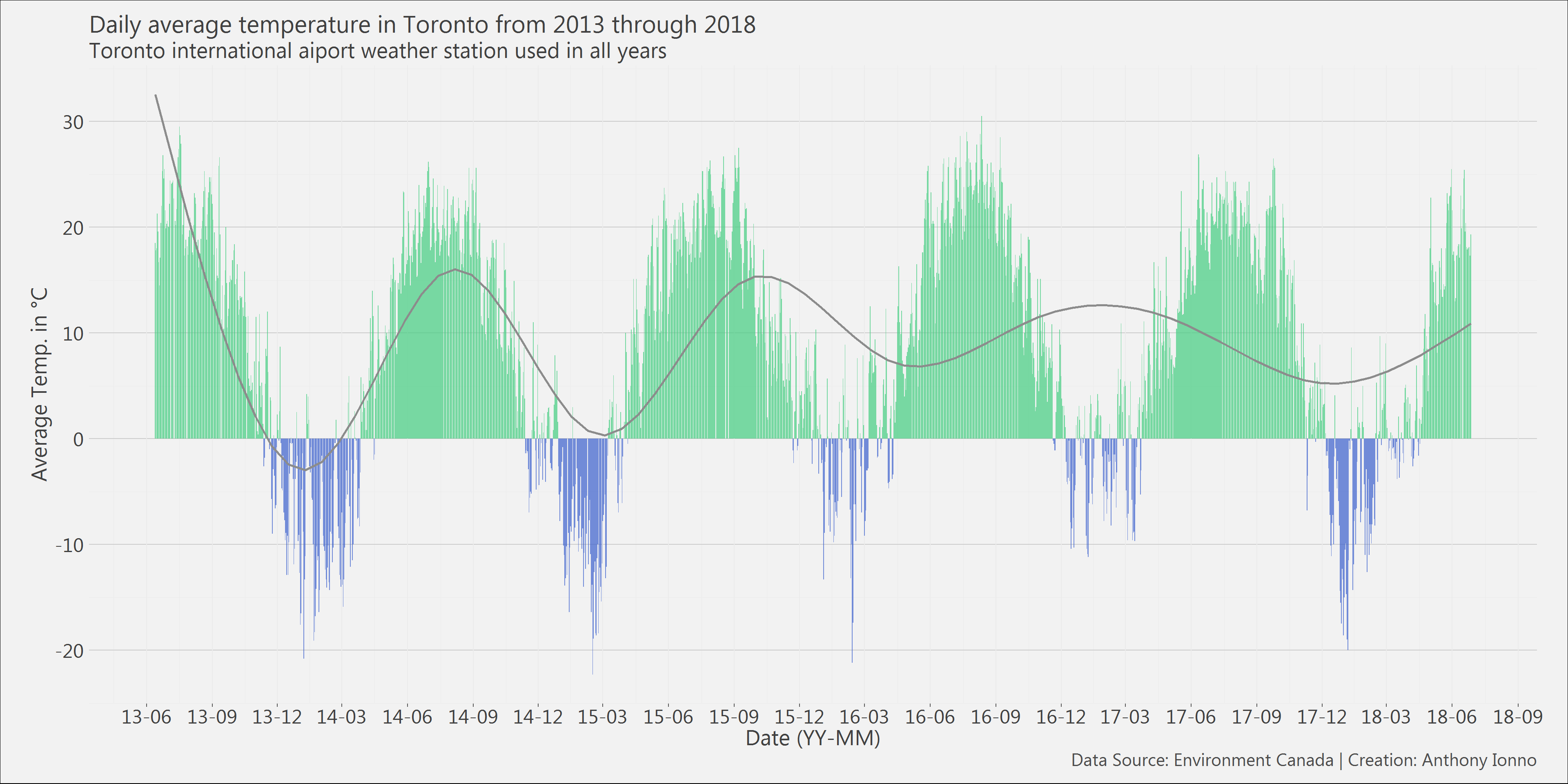
# Daily Maximum Temp.
w_all %>%
  ggplot()+
  geom_col(aes(x = Date, y = max_temp, fill = max_temp<0),alpha=.7)+
  stat_smooth(aes(x = Date, y = max_temp),alpha = .7, se = FALSE, color = "gray55")+
  #stat_smooth(aes(x = Date, y = Max.Temp...C.))+
  #stat_smooth(aes(x = Date, y = Min.Temp...C.))+
  theme_ai()+
  scale_x_date(date_breaks = "3 month", date_labels = "%y-%m")+
  scale_y_continuous(breaks = seq(-20,40,10))+
  scale_fill_manual(values = c("seagreen3","royalblue3"))+
  labs( x = "Date (YY-MM)", y = "Average Temp. in °C",
        title = "Daily maximum temperature in Toronto from 2013 through 2018",
        subtitle = "Toronto international aiport weather station used in all years",
        caption = "Data Source: Environment Canada | Creation: Anthony Ionno")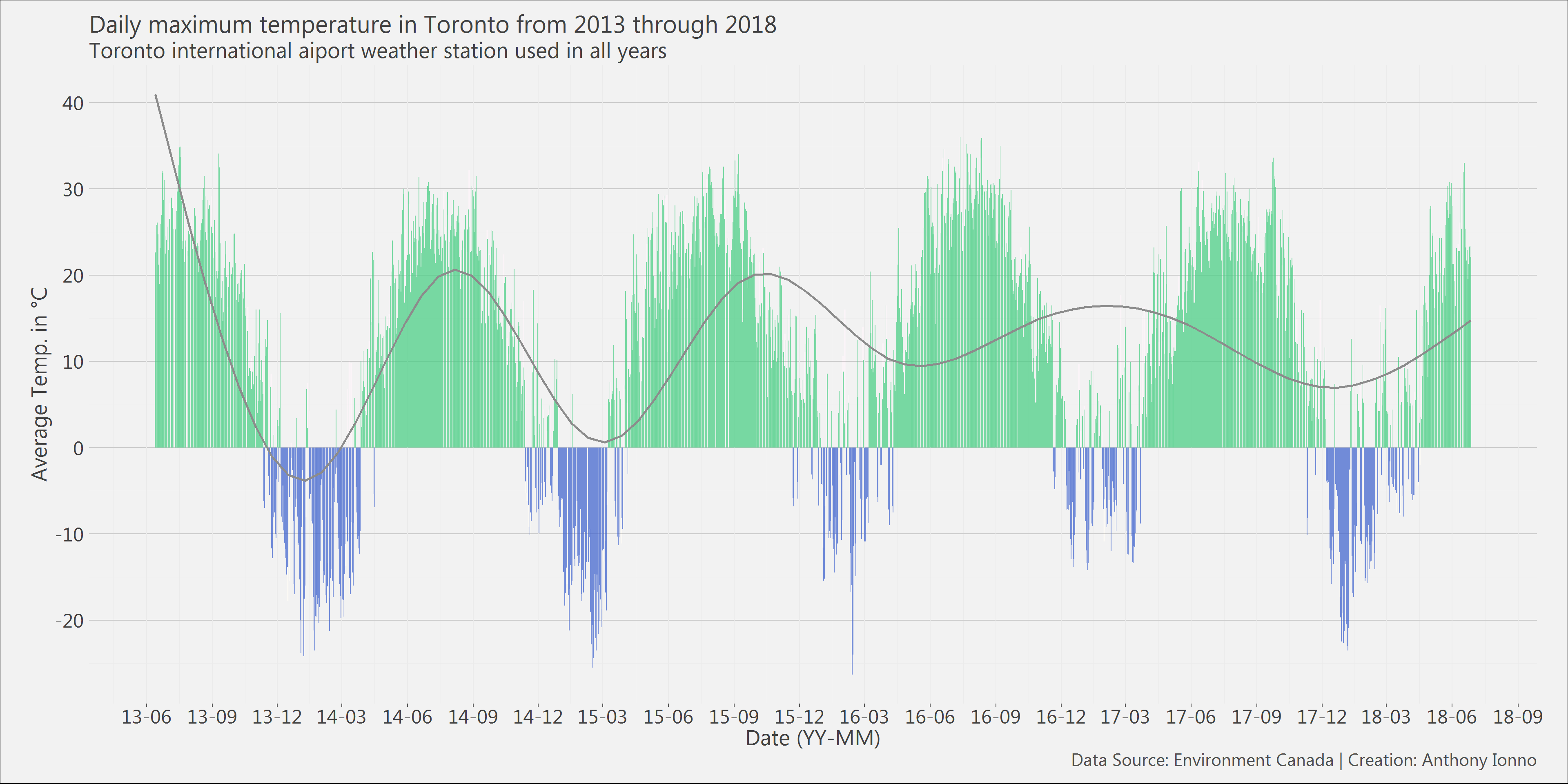
# Table of all the data we used
datatable(select(w_all,Date, Mean.Temp...C.,max_temp)
          ,colnames = c("Date","Mean Temp. in °C", "Max Temp. in °C" ))