
Peeking at the Peaks
Published:
Investigating energy demand data in Ontario.
If you read my About Me section then you are aware that I work within the energy industry within the province of Ontario. Before working within the energy industry, I had never really given much thought to how people use energy, but I think this is an interesting subject that can be explored more fully in Ontario. Especially since the provincial government required that technologies be installed to track customers’ energy usage information at a more granular level, hourly as opposed to monthly (in most cases).
In this post, I want to take a look at energy usage at a system level over the course of a day, broken down by various date variables. This will give us an opportunity to see how the province uses energy during the day broken down by month and season and even by day of the week.
The Independent Electricity Systems Operator (IESO) posts hourly provincial energy demand data that spans as far back as 1994. From 2003 onward this data is broken down by 10 geographic zones within the province, which should be interesting to take a look at as well. This analysis is going to take a look at energy demand data for the 2015 calendar year that is going to be done within the R environment. Alright, let’s read some data into R and see what the first couple of lines look like.
`2015 Demand Data`<-read.csv("ZonalDemands_2015.csv")
head(`2015 Demand Data`)
## Date Hour Total.Ontario Northwest Northeast Ottawa East Toronto
## 1 2015/01/01 1 14960 604 1314 1026 935 5317
## 2 2015/01/01 2 14476 597 1282 988 911 5135
## 3 2015/01/01 3 13979 592 1280 966 900 4976
## 4 2015/01/01 4 13670 590 1301 954 903 4851
## 5 2015/01/01 5 13567 585 1313 954 904 4789
## 6 2015/01/01 6 13787 582 1309 973 928 4807
## Essa Bruce Southwest Niagara West Tot.Zones diff
## 1 1040 57 2881 411 1346 14932 -28
## 2 995 56 2784 388 1289 14425 -51
## 3 957 56 2679 372 1249 14026 47
## 4 933 55 2576 358 1221 13741 71
## 5 929 57 2543 353 1217 13644 77
## 6 939 59 2569 364 1231 13762 -25This data is super clean and tidy but we are going to need some additional date variables in order to move forward. So let’s load the dplyr and magrittr packages into R to edit our data. The dplyr package does the actual data manipulation and the magrittr package just makes it so I can chain statements together and have them execute one after the other.
The date variables I want to create are a month variable ordered from 1 to 12 and two new day variables, one keeping track of what day of the week it is (1-7) and another tracking what day of the month it is (1- whatever the last day of the month is). Once these are created I format my month variable from numbers to actual month names and create a Season variable that has four values and allocates the months as follows:
- Winter - Dec, Jan, and Feb
- Spring - Mar, Apr, and May
- Summer - Jun, July, and Aug
- Fall - Sept, Oct, and Nov
library(dplyr,quietly = TRUE);library(magrittr)

`2015 Demand Data`<-mutate(`2015 Demand Data`, Date=as.Date(Date,format="%Y/%m/%d")) %>%
  mutate(.,Month=as.factor(format(Date,"%m")),DayOfMonth=as.numeric(format(Date,"%d")),DayOfWeek=as.factor(format(Date,"%u")))

levels(`2015 Demand Data`$Month)[1]<-"Jan";levels(`2015 Demand Data`$Month)[2]<-"Feb";levels(`2015 Demand Data`$Month)[3]<-"Mar"
levels(`2015 Demand Data`$Month)[4]<-"Apr";levels(`2015 Demand Data`$Month)[5]<-"May";levels(`2015 Demand Data`$Month)[6]<-"Jun"
levels(`2015 Demand Data`$Month)[7]<-"Jul";levels(`2015 Demand Data`$Month)[8]<-"Aug";levels(`2015 Demand Data`$Month)[9]<-"Sept"
levels(`2015 Demand Data`$Month)[10]<-"Oct";levels(`2015 Demand Data`$Month)[11]<-"Nov";levels(`2015 Demand Data`$Month)[12]<-"Dec"

`2015 Demand Data`<-mutate(`2015 Demand Data`,Season=as.factor(
  if_else(Month %in% c("Jan","Feb","Dec"),"Winter",
          if_else(Month %in% c("Mar","Apr","May"),"Spring",
                  if_else(Month  %in% c("Jun","Jul","Aug"),"Summer",
                          if_else(Month %in%
                                    c("Sept","Oct","Nov"),"Fall","0"))))))
Alright, let’s start plotting some of this data, my preferred way of doing this is using the ggplot2 package. I started using this package approximately 1.5 years ago and while it takes some time to get used to, it can create some very clean, professional looking graphs.
The next couple of figures below look at hourly system energy demand profiles in three ways: the first graph contains hourly load profiles for every day of the year, the second graph contains average daily load profiles broken down by month, and the third graph contains average daily load profiles broken down by season.
require(ggplot2,quietly = TRUE);require(gridExtra);require(grid);require(ggthemes);require(RColorBrewer)

cols <- colorRampPalette(brewer.pal(9, "Set1"))
myPal <- cols(length(unique(`2015 Demand Data`$Month)))

`Daily Load Profiles`=ggplot()+
  geom_line(data = `2015 Demand Data`, aes(x = Hour, y = get("Total.Ontario"), group=interaction(DayOfMonth,Month), colour=Month),alpha=.45,size=.8)+
  theme_hc()+
  scale_color_manual(values = myPal)+
  scale_x_continuous(breaks=c(seq(1,24,2)))+
  theme(legend.position="none",
        panel.grid.major.y = element_line(color="dark grey"),
        axis.title.y = element_text(size=14,face="bold"),
        axis.text.x = element_text(size=12),
        axis.text.y = element_text(size=12))+
  ylab("Energy Demand")+xlab("")

`Average Monthly Load Profile`=ggplot()+
  geom_smooth(data = `2015 Demand Data`, aes(x = Hour, y = get("Total.Ontario"), colour=Month),alpha=.4,size=1.2,se=FALSE)+
  theme_hc()+
  scale_x_continuous(breaks=c(seq(1,24,2)))+
   scale_color_manual(values = myPal)+
  theme(legend.position='right',
        panel.grid.major.y = element_line(color="dark grey"),
        axis.title.x = element_text(size=14,face = "bold"),
        axis.text.x = element_text(size=12),
        axis.text.y = element_text(size=12),
        legend.title = element_text(size=14),
        legend.text = element_text(size=12))+
  ylab("")+xlab("Hour of the Day")

`Average Seasonal Load Profile`=ggplot()+
  geom_smooth(data = `2015 Demand Data`, aes(x = Hour, y = get("Total.Ontario"), colour=Season),alpha=.4,size=1.2,se=FALSE)+
  theme_hc()+
  scale_x_continuous(breaks=c(seq(1,24,2)))+
   scale_color_manual(values = myPal)+
  theme(legend.position='right',
        panel.grid.major.y = element_line(color="dark grey"),
        axis.title.x = element_text(size=14),
        axis.text.x = element_text(size=12),
        axis.text.y = element_text(size=12),
         legend.title = element_text(size=14),
        legend.text = element_text(size=12))+
  ylab("")+xlab("")

grid.arrange(`Daily Load Profiles`,`Average Monthly Load Profile`,`Average Seasonal Load Profile`,ncol=3,top=textGrob("Provincial Energy Demand Profiles in 2015",gp=gpar(fontsize=16,font=2)))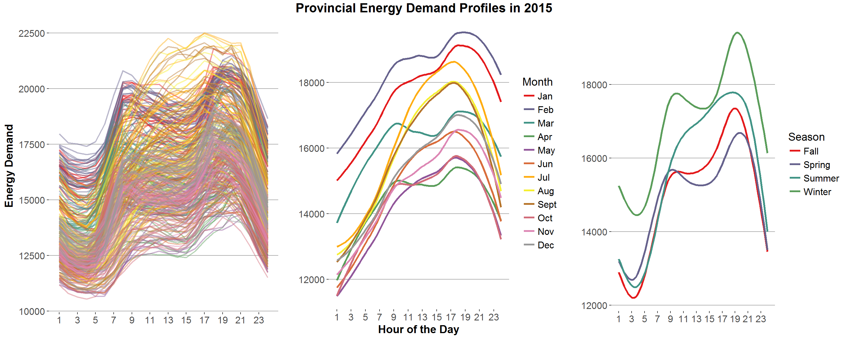
Starting from the leftmost graph we can get a sense of daily provincial energy demand, broken down by month. The yearly peak, the highest point of energy demanded within the province, seems to have occurred in on the Tuesday July 28 at 5pm (heatmaps I produce later on in this post confirm this to be true).
Although I don’t produce any variability measures, you can get a sense just by eyeballing the graphs that some months are far more variable in daily energy demand than others. Comparing the daily load profiles to the average monthly load profiles (first and second graphs) January and February seem to be more consistent than say July and August, which appear to be all over the place and this shows in the average monthly load profiles. January and February are everywhere above the other average monthly load profiles, while April, May, and October are duking it out for last place.
The final graph presents average load profiles grouped by season and shows, for at least most hours of the day that the winter and summer seasons are more energy intensive than the fall and spring seasons. However, the summer season curve does not exhibit the same sort of pronounced bi-modal peak of the other three curves.
Alright, let’s produce the same set of graphs as before but exclude weekends.
`Daily Load Profiles`=ggplot()+
  geom_line(data = filter(`2015 Demand Data`, !(DayOfWeek %in% c(6,7))) , aes(x = Hour, y = get("Total.Ontario"), group=interaction(DayOfMonth,Month), colour=Month),alpha=.45,size=.8)+
  theme_hc()+
  scale_color_manual(values = myPal)+
  scale_x_continuous(breaks=c(seq(1,24,2)))+
  theme(legend.position='none',
        panel.grid.major.y = element_line(color="dark grey"),
         axis.title.y = element_text(size=14,face="bold"),
        axis.text.x = element_text(size=12),
        axis.text.y = element_text(size=12))+
  ylab("Energy Demand")+xlab("")

`Average Monthly Load Profile`=ggplot()+
  geom_smooth(data =  filter(`2015 Demand Data`, !(DayOfWeek %in% c(6,7))), aes(x = Hour, y = get("Total.Ontario"), colour=Month),alpha=.4,size=1.2,se=FALSE)+
   theme_hc()+
    scale_color_manual(values = myPal)+
  scale_x_continuous(breaks=c(seq(1,24,2)))+
  theme(legend.position='right',
        panel.grid.major.y = element_line(color="dark grey"),
        axis.title.x = element_text(size=14,face="bold"),
        axis.text.x = element_text(size=12),
        axis.text.y = element_text(size=12),
         legend.title = element_text(size=14),
        legend.text = element_text(size=12))+
  ylab("")+xlab("Hour of the Day")

`Average Seasonal Load Profile`=ggplot()+
  geom_smooth(data = filter(`2015 Demand Data`, !(DayOfWeek %in% c(6,7))), aes(x = Hour, y = get("Total.Ontario"), colour=Season),alpha=.4,size=1.2,se=FALSE)+
  theme_hc()+
    scale_color_manual(values = myPal)+
  scale_x_continuous(breaks=c(seq(1,24,2)))+
  theme(legend.position='right',
        panel.grid.major.y = element_line(color="dark grey"),
        axis.title.x = element_text(size=14),
        axis.text.x = element_text(size=12),
        axis.text.y = element_text(size=12),
         legend.title = element_text(size=14),
        legend.text = element_text(size=12))+
  ylab("")+xlab("")

grid.arrange(`Daily Load Profiles`,`Average Monthly Load Profile`,`Average Seasonal Load Profile`,ncol=3,top=textGrob("Provincial Energy Demand Profiles in 2015, Excluding Weekends",gp=gpar(fontsize=16,font=2))) 
Looks similar enough to the previous set of graphs. Lets look at the same set of graphs but weekends only.
`Daily Load Profiles`=ggplot()+
  geom_line(data = filter(`2015 Demand Data`, (DayOfWeek %in% c(6,7))) , aes(x = Hour, y = get("Total.Ontario"), group=interaction(DayOfMonth,Month), colour=Month),alpha=.45,size=.8)+
  theme_hc()+
  scale_color_manual(values = myPal)+
  scale_x_continuous(breaks=c(seq(1,24,2)))+
  theme(legend.position='none',
        axis.title.y = element_text(size=14, face="bold"),
        axis.text.x = element_text(size=12),
        axis.text.y = element_text(size=12))+
  ylab("Energy Demand")+xlab("")

`Average Monthly Load Profile`=ggplot()+
  geom_smooth(data =  filter(`2015 Demand Data`, (DayOfWeek %in% c(6,7))), aes(x = Hour, y = get("Total.Ontario"), colour=Month),alpha=.4,size=1.2,se=FALSE)+
  theme_hc()+
  scale_color_manual(values = myPal)+
  scale_x_continuous(breaks=c(seq(1,24,2)))+
  theme(legend.position='right',
        panel.grid.major.y = element_line(color="dark grey"),
        axis.title.x = element_text(size=14, face="bold"),
        axis.text.x = element_text(size=12),
        axis.text.y = element_text(size=12),
         legend.title = element_text(size=14),
        legend.text = element_text(size=12))+
  ylab("")+xlab("Hour of the Day")

`Average Seasonal Load Profile`=ggplot()+
  geom_smooth(data = filter(`2015 Demand Data`, (DayOfWeek %in% c(6,7))), aes(x = Hour, y = get("Total.Ontario"), colour=Season),alpha=.4,size=1.2,se=FALSE)+
  theme_hc()+
  scale_color_manual(values = myPal)+
  scale_x_continuous(breaks=c(seq(1,24,2)))+
  theme(legend.position='right',
        panel.grid.major.y = element_line(color="dark grey"),
        axis.title.x = element_text(size=14),
        axis.text.x = element_text(size=12),
        axis.text.y = element_text(size=12),
         legend.title = element_text(size=14),
        legend.text = element_text(size=12))+
  ylab("")+xlab("")

grid.arrange(`Daily Load Profiles`,`Average Monthly Load Profile`,`Average Seasonal Load Profile`,ncol=3,top=textGrob("Provincial Energy Demand Profiles in 2015, Excluding Weekdays",gp=gpar(fontsize=16,font=2))) 
It appears that on weekends (in 2015 at least), Ontario experiences a gradual increase in energy demand that peaks somewhere between 5pm and 8pm, depending on the month and or season. The average winter system load profile is everywhere above the other seasonal load profiles.
Okay, now lets take a look at system load profiles, broken down by day of the week. Before I do this I want to format the weekly date variable from a number format (1-7) to a date format (Mon-Sun), it’ll look nicer and I am picky.
levels(`2015 Demand Data`$DayOfWeek)[1]<-"Mon";levels(`2015 Demand Data`$DayOfWeek)[2]<-"Tues";levels(`2015 Demand Data`$DayOfWeek)[3]<-"Weds"
levels(`2015 Demand Data`$DayOfWeek)[4]<-"Thurs";levels(`2015 Demand Data`$DayOfWeek)[5]<-"Fri";levels(`2015 Demand Data`$DayOfWeek)[6]<-"Sat"
levels(`2015 Demand Data`$DayOfWeek)[7]<-"Sun"

`Daily Load Profiles`=ggplot()+
  geom_line(data = filter(`2015 Demand Data`, !(DayOfWeek %in% c("Sat","Sun"))) , aes(x = Hour, y = get("Total.Ontario"), group=interaction(DayOfMonth,Month), colour=Month),alpha=.45,size=.8)+
  theme_hc()+
  scale_color_manual(values = myPal)+
  scale_x_continuous(breaks=c(seq(1,24,3)))+
  theme(panel.spacing = unit(2, "lines"),legend.position='right',
        axis.title.y= element_text(size=14, face="bold"),
        axis.title.x = element_text(size=14, face="bold"),
        axis.text.x = element_text(size=12),
        axis.text.y = element_text(size=12),
         legend.title = element_text(size=14),
        legend.text = element_text(size=12),
         strip.text = element_text(size=12, face = "bold"))+
  ylab("Energy Demand")+xlab("Hour of the Day")

`Average Monthly Load Profile`=ggplot()+
  geom_smooth(data =  filter(`2015 Demand Data`, !(DayOfWeek %in% c("Sat","Sun"))), aes(x = Hour, y = get("Total.Ontario"), colour=Month),se=FALSE,alpha=.4,size=1.2)+
  theme_hc()+
  scale_color_manual(values = myPal)+
  scale_x_continuous(breaks=c(seq(1,24,3)))+
  theme(panel.spacing = unit(2, "lines"),
        panel.grid.major.y = element_line(color="dark grey"),
        legend.position='right',
         axis.title.y= element_text(size=14, face="bold"),
        axis.title.x = element_text(size=14, face="bold"),
        axis.text.x = element_text(size=12),
        axis.text.y = element_text(size=12),
         legend.title = element_text(size=14),
        legend.text = element_text(size=12),
         strip.text = element_text(size=12, face = "bold"))+
  ylab("Energy Demand")+xlab("Hour of the Day")

`Average Season Load Profile`=ggplot()+
  geom_smooth(data =  filter(`2015 Demand Data`, !(DayOfWeek %in% c("Sat","Sun"))), aes(x = Hour, y = get("Total.Ontario"), colour=Season),se=FALSE,alpha=.4,size=1.2)+
  theme_hc()+
  scale_color_manual(values = myPal)+
  scale_x_continuous(breaks=c(seq(1,24,3)))+
  theme(panel.spacing = unit(2, "lines"),
        panel.grid.major.y = element_line(color="dark grey"),
        legend.position='right',
         axis.title.y= element_text(size=14, face="bold"),
        axis.title.x = element_text(size=14, face="bold"),
        axis.text.x = element_text(size=12),
        axis.text.y = element_text(size=12),
         legend.title = element_text(size=14),
        legend.text = element_text(size=12),
        strip.text = element_text(size=12))+
  ylab("Energy Demand")+xlab("Hour of the Day")

grid.arrange(`Daily Load Profiles` + facet_grid(. ~ DayOfWeek),
  `Average Monthly Load Profile` + facet_grid(. ~ DayOfWeek),
  `Average Season Load Profile`+ facet_grid(. ~ DayOfWeek),nrow=3)
The seasonal graphs seem to show, that on average, the winter and summer seasonal load profiles appear to have a higher overall system demand between 10am and 8pm than the fall and spring seasons.
Finally, because why not, and I want an excuse to play around with the d3heatmap package. Lets create two pretty heatmaps that have the month of the year on the horizontal axis, the day of the week or month on the vertical axis and each cell within the heatmap contains the max demand within that week or month day/ month of the year combination.
library(reshape2);library(d3heatmap);library(gridExtra)
data_long<-group_by(`2015 Demand Data`,Month,DayOfWeek) %>%
  summarise(.,`Peak Demand`=max(Total.Ontario))

data_wide_day <- dcast(data_long, DayOfWeek ~ Month, value.var="Peak Demand")

d3heatmap(data_wide_day[,2:13], scale="column", colors="YlOrRd",Rowv = FALSE,Colv = FALSE)
library(reshape2);library(d3heatmap);library(gridExtra)
data_long<-group_by(`2015 Demand Data`,Month,DayOfMonth) %>%
  summarise(.,`Peak Demand`=max(Total.Ontario))

data_wide_month <- dcast(data_long, DayOfMonth ~ Month, value.var="Peak Demand")

d3heatmap(data_wide_month[,2:13], scale="column", colors="YlOrRd",Rowv = FALSE,Colv = FALSE)
If this is not interactive, then I have failed. But it still looks cool! The comparison between the weekly and monthly day variables are interesting. Conditional on month, the first four days of the week appear to always have a higher maximum system demand than the last three days of the week (except for February, August, and November who seem to want to ruin this for me). The second heat map shows that the monthly maximum is typically grouped with daily maximum demands that are larger than that month’s average daily maximum demand.
Given that the heat maps above have provided us with information on when the monthly maximums occur, let’s compare these maximum load profiles to the average daily load profiles we created earlier.
`Monthly Maximums`<-c(7,19,5,8,26,22,28,17,2,28,23,1)

maxLoadProfiles<-data.frame()
maxLoadProfiles<-rbind(filter(`2015 Demand Data`,Month==levels(`2015 Demand Data`$Month)[1],DayOfMonth==`Monthly Maximums`[1]))
for(i in 2:12){
  maxLoadProfiles<-rbind(maxLoadProfiles,filter(`2015 Demand Data`,Month==levels(`2015 Demand Data`$Month)[i],DayOfMonth==`Monthly Maximums`[i]))
}

`Max. Monthly Demand Load Profile`<-ggplot()+
   geom_smooth(data = maxLoadProfiles, aes(x = Hour,y=get("Total.Ontario"),
                                            colour=Month),alpha=1,size=1.2,se=FALSE)+
  theme_hc() +
  scale_color_manual(values = myPal)+
  scale_x_continuous(breaks=c(seq(1,24,2)))+
  theme(panel.grid.major.y = element_line(color="dark grey"),
        legend.position='none',
         axis.title.y= element_text(size=14, face="bold"),
        axis.title.x = element_text(size=14, face="bold"),
        axis.text.x = element_text(size=12),
        axis.text.y = element_text(size=12),
         legend.title = element_text(size=14),
        legend.text = element_text(size=12))+
  ylab("Energy Demand")+xlab("Hour of the Day")

`Average Monthly Load Profile`=ggplot()+
  geom_smooth(data = `2015 Demand Data`, aes(x = Hour, y = get("Total.Ontario"),
                                             colour=Month),alpha=.4,size=1.2,se=FALSE)+
 theme_hc()+
 scale_color_manual(values = myPal)+
  scale_x_continuous(breaks=c(seq(1,24,2)))+
 theme(panel.grid.major.y = element_line(color="dark grey"),
        legend.position='right',
        axis.title.y= element_text(size=14, face="bold"),
        axis.title.x = element_text(size=14, face="bold"),
        axis.text.x = element_text(size=12),
        axis.text.y = element_text(size=12),
         legend.title = element_text(size=14),
        legend.text = element_text(size=12))+
  ylab("Energy Demand")+xlab("Hour of the Day")

`Max. Seasonal Demand Load Profile`<-ggplot()+
   geom_smooth(data = maxLoadProfiles, aes(x = Hour,y=get("Total.Ontario"),
                                            colour=Season),alpha=1,size=1.2,se=FALSE)+
  theme_hc() +
  scale_color_manual(values = myPal)+
  scale_x_continuous(breaks=c(seq(1,24,2)))+
  theme(panel.grid.major.y = element_line(color="dark grey"),
        legend.position='none',
         axis.title.y= element_text(size=14, face="bold"),
        axis.title.x = element_text(size=14, face="bold"),
        axis.text.x = element_text(size=12),
        axis.text.y = element_text(size=12),
         legend.title = element_text(size=14),
        legend.text = element_text(size=12))+
  ylab("Energy Demand")+xlab("Hour of the Day")

`Average Seasonal Load Profile`=ggplot()+
  geom_smooth(data = `2015 Demand Data`, aes(x = Hour, y = get("Total.Ontario"),
                                          colour=Season),alpha=.4,size=1.2,se=FALSE)+
  theme_hc()+
  scale_color_manual(values = myPal)+
  scale_x_continuous(breaks=c(seq(1,24,2)))+
  theme(panel.grid.major.y = element_line(color="dark grey"),
        legend.position='right',
         axis.title.y= element_text(size=14, face="bold"),
        axis.title.x = element_text(size=14, face="bold"),
        axis.text.x = element_text(size=12),
        axis.text.y = element_text(size=12),
         legend.title = element_text(size=14),
        legend.text = element_text(size=12))+
  ylab("Energy Demand")+xlab("Hour of the Day")

grid.arrange(`Max. Monthly Demand Load Profile`, `Average Monthly Load Profile`, ncol=2,
             top=textGrob("Comparing Monthly Maximum and Average Load Profiles",gp=gpar(fontsize=16,font=2)))
grid.arrange(`Max. Seasonal Demand Load Profile`, `Average Seasonal Load Profile`, ncol=2,
             top=textGrob("Comparing Seasonal Maximum and Average Load Profiles",gp=gpar(fontsize=16,font=2)))
This is it, the last set of graphs for this post! In terms of monthly maximums, Ontario definitely experiences higher demand (at least in 2015) in the summer period I defined. However, on average the winter seasonal load profile is everywhere above the summer load profile. I think in a future post it would be interesting to look across multiple years to see what sort of seasonal relationships exist, while also accounting for weather.