
Dude, Where’s my Streetcar?
Published:
A text-based analysis of Toronto Transit Commission Twitter data.
Introduction
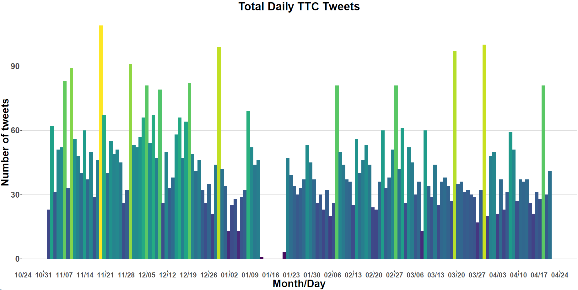
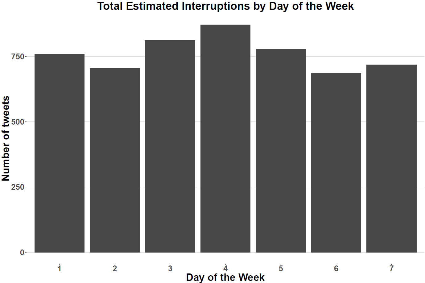
In this post I thought it would be interesting to download some data from the Toronto Transit Commission’s (TTC) twitter page and conduct some text mining on said data to get a better sense of interruptions of service (IOS) within the city of Toronto. Specifically, I want to understand which subway stops, and streetcar routes seem to receive the most attention on the TTC’s twitter feed and also appear to suffer from some sort of IOS. In order to do that I have downloaded six months’ worth of data from the @TTCNotices twitter feed. My intention was to do this post with only three months’ worth of data; however this post got delayed by several months, providing me with the opportunity to collect even more data (hooray!). Just to give you a sense of what to expect I created a neat distribution of total tweets, broken down by day below.
Main Findings and Considerations
I’ve decided to summarise all my findings first so that if you aren’t interested in seeing the more technical aspects of this post then you don’t need to read past this section(hooray!?x2).
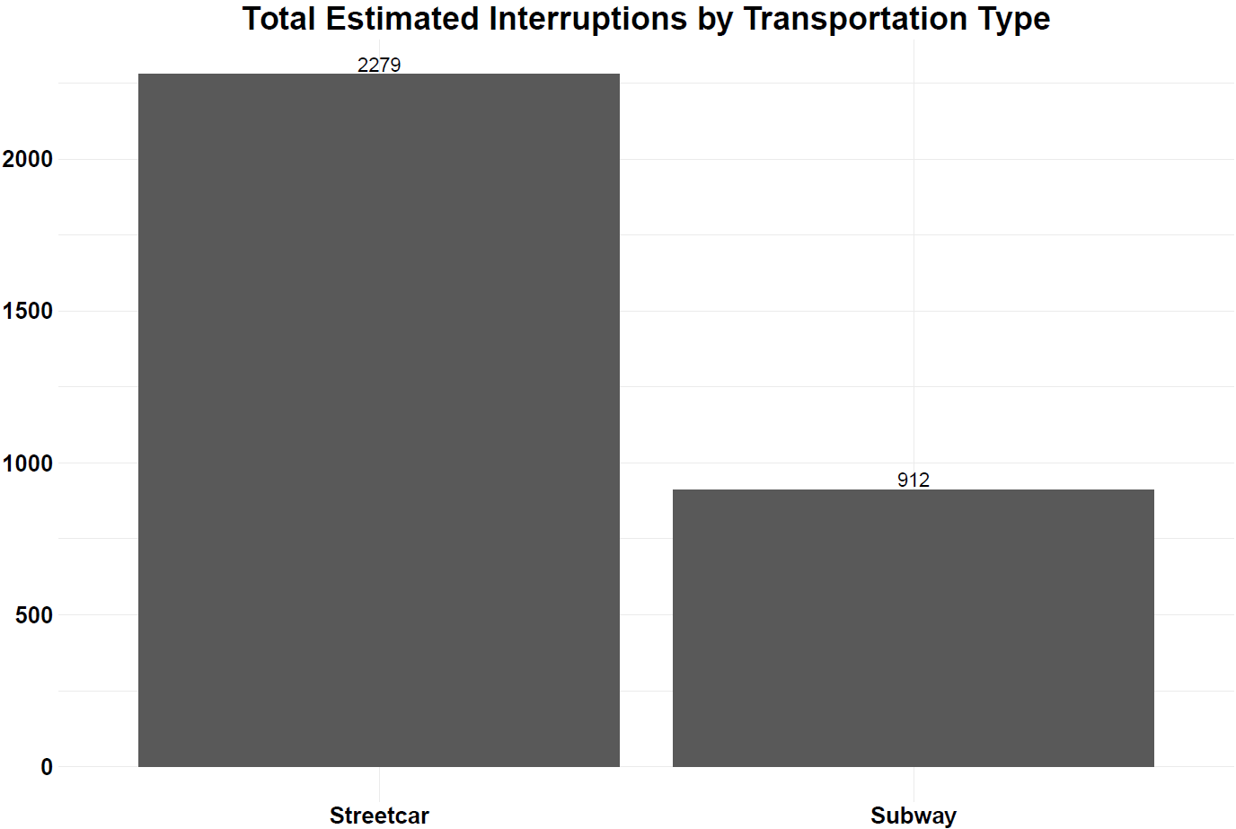
- IOS tweets about streetcar routes are significantly more frequent than those about subway stations. Over the 6 months’ worth of data there are 2,279 tweets that have to do with IOS for streetcar routes compared to 912 for subway stations.
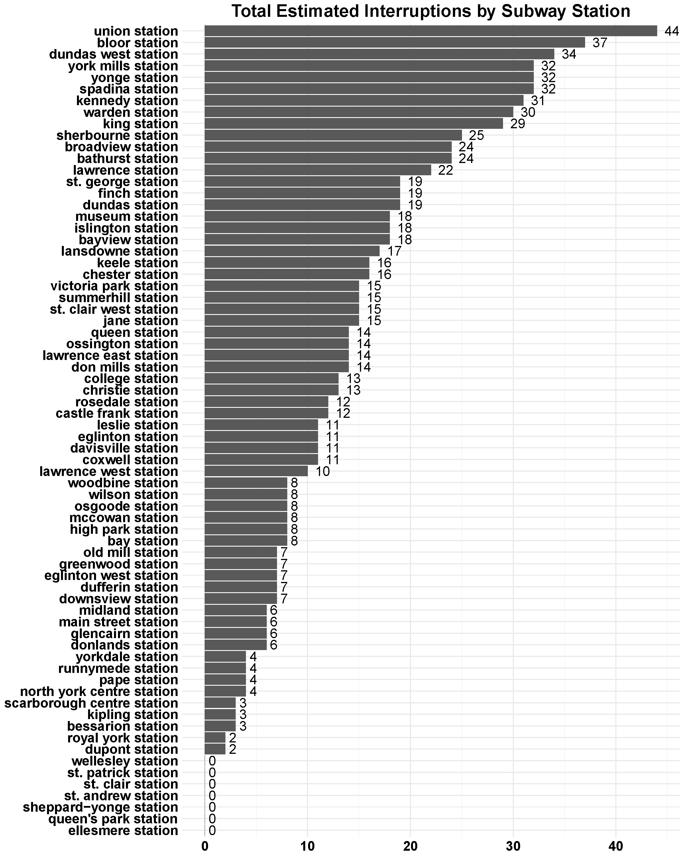
- The subway stations with the largest amount of IOS tweets are Union, Bloor, and Dundas West stations with 44, 37, and 34 IOS tweets.
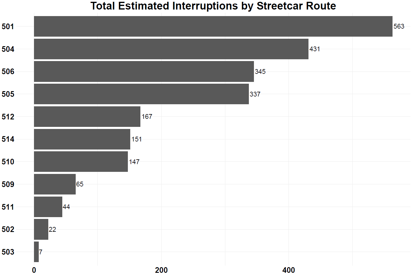
- The 501 Queen streetcar recorded the most IOS tweets and by a large margin, the next streetcar the 504 King recorded 127 fewer IOS tweets.
- IOS tweets and which day of the week it is are independent of one another (i.e., There is not enough evidence to suggest that IOS tweets and day of the week are dependent of one another). For the figure below one represents Monday and seven represents Sunday.
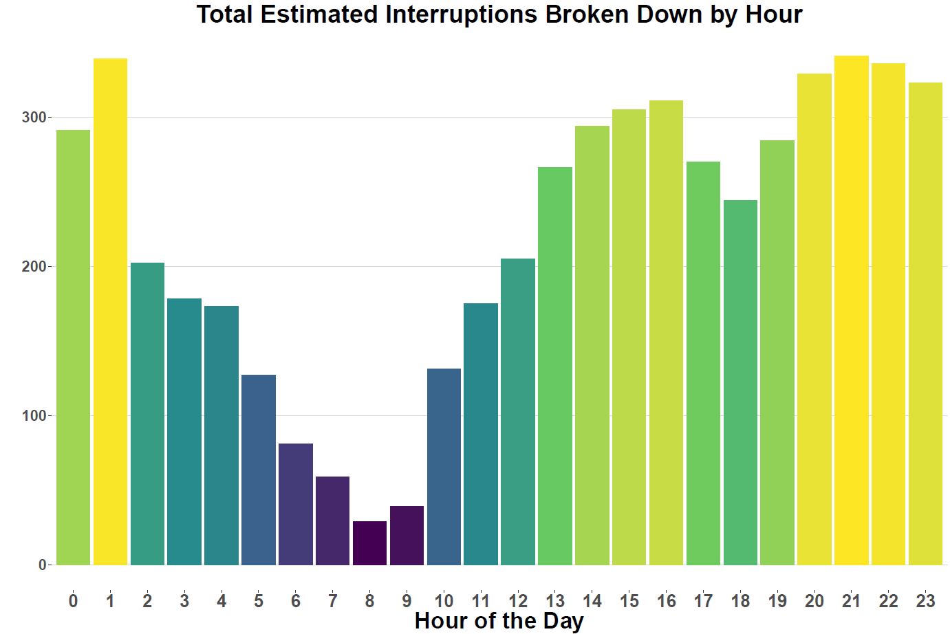
- IOS tweets by hour suggest that the fewest amount of interruptions occur in the morning, between 8-10am, and more frequently late at night, between 8pm to 2am.
- This can differ significantly by subway station and to show that I created a Shiny app that will dynamically update a graph for you depending on the subway station you select.
I think its worth bringing up that these findings are all based on estimates that I constructed and should be thought of as informative but obviously not definitive, there is a lot of work to go before we can get to that point. However, I do think this analysis is promising and I look forward to making improvements and adjustments as time progresses. I was also going to include results with bus routes but I’ve run into some technical difficulties identifying bus routes correctly. I hope to make an edit to this post or do a separate post where I incorporate those results into this work.
Data
As mentioned in the summary section I acquired this data from the @TTCNotices twitter account in two pulls. The first pull occurred a couple months ago and the most recent pull was performed approximately 5 days ago. Requesting information from the twitter API restricts the number of observations you can get any time so by waiting three months I was able to get another three months’ worth of data. In total, the entire sample contains roughly 6.3 thousand data points and if we take the straight average of the number of data points divided by the number of weeks that translates to approximately 245 tweets a week or 1,062 tweets a month.
In order to get a list of the subways stops and streetcar routes in the city I pulled information off of the TTC’s main webpage.
All the information I used for this project is located in my github page here.
If you are interested in learning about how you can pull data from twitter for yourself, through R then I recommend you read the following resources:
- https://dev.twitter.com/overview/api
- https://www.r-bloggers.com/getting-started-with-twitter-in-r/
- https://www.r-bloggers.com/analyzing-the-us-election-using-twitter-and-meta-data-in-r/
So first I am going to load all the necessary packages into R, show the line of code I used to pull twitter data into R and then use a function called ‘textScrubber’ to basically remove everything except words from each tweet in the data I download. I snagged this useful function from the second post above.
library(twitteR)
library(ROAuth)
library(dplyr)
library(stringr)
library(ggplot2)
library(lubridate)
library(scales)
library(viridisLite)
library(ggthemes)
library(tidytext)

textScrubber <- function(dataframe) {

  dataframe$text <-  gsub("-", " ", dataframe$text)
  dataframe$text <-  gsub("&", " ", dataframe$text)
  dataframe$text <-  gsub("[[:punct:]]", " ", dataframe$text)
  dataframe$text <-  gsub("[[:digit:]]", "", dataframe$text)
  dataframe$text <-  gsub("http\\w+", "", dataframe$text)
  dataframe$text <-  gsub("\n", " ", dataframe$text)
  dataframe$text <-  gsub("[ \t]{2,}", "", dataframe$text)
  dataframe$text <-  gsub("^\\s+|\\s+$", "", dataframe$text)
  dataframe$text <-  tolower(dataframe$text)

  return(dataframe)
}

ttc_tweets <- userTimeline(user = "@TTCnotices",
                               n = 4000, includeRts = FALSE, retryOnRateLimit = 2000)
df=twListToDF(ttc_tweets)
ttc_tweets <- textScrubber(df)
Analysis
This analysis would have been incredibly difficult if the TTC did not utilize some sort of standardized language in describing its IOS. After reviewing this language, I was able to create a dictionary of IOS terms that segments the ‘type’ of interruption that is occurring. In total, the IOS dictionary I created contains seven terms: bypassing, delay, diverting, holding, suspended, longer than normal travel, and turning back.
I can also provide some examples of what a tweet looks like with each of these dictionary terms:
- Bypassing – 506 carlton bypassing howard park ave due to a collision at roncesvalles and howard park.
- Delay – all clear: the delay westbound at yonge station has now cleared and regular service has resumed on line 2.
- Diverting – 504 king route diverting westbound via queen, parliament due to a stalled streetcar at king & sumach.
- Holding – trains holding southbound at bloor station due to mechanical difficulties on board a train.
- Suspended – service suspended on line 2, bloor danforth, from yonge to broadview, due to a trespasser at track level at sherbourne station.
- Longer than Normal Travel – longer than normal travel expected on line 1, wilson to downsview, due to signal related issues at downsview station.
- Turning Back – 501 queen turning back from queen and kingston road, due to a collision at queen and neville park.
Now that the data is clean and tidy I can count those dictionary terms and place each of them their own separate variables using dplyr’s mutate command and an if-else chain. I am also going to create some additional date variables beyond what was provided to me in the original dataset.
df<-mutate(df,delay=str_extract(words, c("delay")),
       holding=str_extract(words, c("holding")),
       diverting=str_extract(words, c("diverting")),
       suspended=str_extract(words,c("suspended")),
       bypassing=str_extract(words,c("bypassing")),
       LTNTT=str_extract(words,c("longer than normal travel")),
       TB=str_extract(words,"turning back"),
       AC=str_extract(words, "all clear"))

df[is.na(df)]<-"0"

df<-mutate(df,`Stop Type`=as.factor(ifelse(delay=="delay","Delay",
                       ifelse(holding=="holding","Holding",
                              ifelse(diverting=="diverting","Diverting",
                                     ifelse(suspended=="suspended","Suspended",
                                            ifelse(bypassing=="bypassing","Bypassing",
                                                   ifelse(LTNTT=="longer than normal travel","LTNTT",
                                                          ifelse(TB=="turning back","Turning Back","Other")))))))))

df<-mutate(df,DayOfMonth=format(created,"%d"),Month=format(created,"%h"),DayOfWeek=format(created,"%u"),
           Time=format(created,"%H:%M"),Hour=format(created,"%H"))
Now that all the additional variables are created we can take a look at each of the total tweets, by subway station and streetcar route and a breakdown of each by the different IOS types.In order to create the plots I used a function that loops through each of the stations or routes and IOS words and provides a count for each.
#Reading in subway station and streetcar route information
subwayStops<-read.csv("TTC Subway Stations.csv")
streetcarRoutes<-read.csv("TTC Streetcar Routes.csv")

#Creating subway and streetcar dataframes
subwayStoptypeFrame<-subwayStops
subwayStoptypeFrame<-mutate(subwayStoptypeFrame,`Bypassing`=0,`Delay`=0,`Diverting`=0,`Holding`=0,`Suspended`=0,`LTNT`=0, `Turning Back`=0)
streetcarStoptypeFrame<-streetcarRoutes
streetcarStoptypeFrame<-mutate(streetcarStoptypeFrame,`Bypassing`=0,`Delay`=0,`Diverting`=0,`Holding`=0,`Suspended`=0,`LTNT`=0, `Turning Back`=0)

#This function loops through each of the stations and each of the IOS words and provides a count of each
StoptypeCount<-function(frame1,frame2,frame3){
for(i in 1:nrow(frame1)){
for(j in 1:length(frame2)){
  temp<-data.frame(sapply(str_to_lower(df$words), function(x) all(sapply(c(frame1[i,1],frame2[j]), str_detect, string = x))))
names(temp)[1]<-"value"
a<-as.integer(temp %>% filter(.,value==TRUE)%>% summarise(.,count=n()))
frame3[i,j+1]<-a
}
}
return(frame3)
}
stopTypeWords<-c("bypassing","delay","diverting","holding","suspended","longer than normal travel", "turning back")

#Creating subway station count dataframe
subwayStoptypeFrame<-StoptypeCount(subwayStops,stopTypeWords,subwayStoptypeFrame)

#Summing IOS counts
subwayStoptypeFrame<- cbind(subwayStoptypeFrame,rowSums(subwayStoptypeFrame[,2:8]))
names(subwayStoptypeFrame)[9]<-"Total Subway Interruptions"
#Plotting function for total subway interruptions, broken down by subway station
subwayStoptypeFrame %>%
  ggplot(aes(reorder(Station, `Total Subway Interruptions`),`Total Subway Interruptions`)) +
  theme_minimal()+
  ggtitle("Total Estimated Interruptions by Subway Station")+
  theme( legend.position = 'none',
         axis.title.x = element_text(size=20,face = "bold"),
         axis.text.x = element_text(size=17,face = "bold",colour = "black"),
         axis.title.y = element_text(size=20, face = "bold"),
         axis.text.y = element_text(size=17, face="bold",colour = "black"),
         plot.title = element_text(size=22,hjust=.5, face = "bold"))+
  geom_text(aes(label=`Total Subway Interruptions`), hjust=-1, size=6)+
  geom_bar(stat = "identity") +
  xlab(NULL) +
  ylab(NULL)+
  coord_flip()

#Similarly for streetcar routes
streetcarStoptypeFrame<-StoptypeCount(streetcarRoutes,stopTypeWords,streetcarStoptypeFrame)
streetcarStoptypeFrame<- cbind(streetcarStoptypeFrame,rowSums(streetcarStoptypeFrame[,2:8]))
names(streetcarStoptypeFrame)[9]<-"Total Streetcar Interruptions"

streetcarStoptypeFrame %>%
  ggplot(aes(reorder(route, `Total Streetcar Interruptions`),`Total Streetcar Interruptions`)) +
  ggtitle("Total Estimated Interruptions by Streetcar Route")+
  theme_minimal()+
  theme( legend.position = 'none',
         axis.title.x = element_text(size=20,face = "bold"),
         axis.text.x = element_text(size=17,face = "bold",colour = "black"),
         axis.title.y = element_text(size=20, face = "bold"),
         axis.text.y = element_text(size=17, face="bold",colour = "black"),
         plot.title = element_text(size=22,hjust=.5, face = "bold"))+
  geom_text(aes(label=`Total Streetcar Interruptions`), hjust=-.1, size=6)+
  geom_bar(stat = "identity") +
  xlab(NULL) +
  ylab(NULL)+
  coord_flip()

#Subway, bus, and streetcar routes all aggregated together
totalInterruptions<-data.frame(c("Streetcar","Subway"),
                               sum(streetcarStoptypeFrame$`Total Streetcar Interruptions`),
                               sum(subwayStoptypeFrame$`Total Subway Interruptions`))
names(totalInterruptions)<-c("Transportation Type","Total Interruptions")
totalInterruptions[2,2]<-912
totalInterruptions %>%
  ggplot(aes(as.factor(`Transportation Type`),`Total Interruptions` )) +
  ggtitle("Total Estimated Interruptions by Transportation Type")+
  theme( legend.position = 'none',
         axis.title.x = element_text(size=20,face = "bold"),
         axis.text.x = element_text(size=17,face = "bold",colour = "black"),
         axis.title.y = element_text(size=20, face = "bold"),
         axis.text.y = element_text(size=17, face="bold",colour = "black"),
         plot.title = element_text(size=22,hjust=.5, face = "bold"))+
  geom_text(aes(label=`Total Interruptions`), vjust=-.2, size=6)+
  geom_bar(stat = "identity") +
  xlab(NULL) +
  ylab(NULL)
We can also look at total broken down by which day of the week it is and use a Pearson’s chi-squared test to determine if the number of IOS tweets are independent of which day of the week it is. We can also do this including and excluding weekends to see if there is any significant difference in our result.
# Plotting Number of IOS tweets against which day of the week it is
ggplot(data = filter(df,`Stop Type`!='Other'), aes(x = DayOfWeek)) +
  geom_histogram(aes(fill = ..count..),stat = "count",bins =72) +
  theme_hc()+
  ggtitle("Total Estimated Interruptions by Day of the Week")+
  theme( legend.position = 'none',
         axis.title.x = element_text(size=20,face = "bold"),
         axis.text.x = element_text(size=17,face = "bold"),
         axis.title.y = element_text(size=20, face = "bold"),
         axis.text.y = element_text(size=17, face="bold"),
         plot.title = element_text(size=22,
                                   hjust=.5, face = "bold"))+
  xlab("Day of the Week") + ylab("Number of tweets") +
  scale_fill_gradientn(colours = "grey28")

# Performing Pearson’s Chi-squared test for independence
chisq.test(ggplot_build(chisquare)$data[[1]][,c(5)],ggplot_build(chisquare)$data[[1]][,c(3)])

#	Pearson's Chi-squared test

#data:  ggplot_build(chisquare)$data[[1]][, c(5)] and ggplot_build(chisquare)$data[[1]][, c(3)]
#X-squared = 42, df = 36, p-value = 0.227
Based on the results of our chi-square test we can state that there is not enough evidence to suggest that IOS tweets and days of the week are dependent on another.
Determining how IOS tweets are distributed throughout the day should also be fairly interesting. I always remember the times where I am on the subway in the morning during rush hour and the TTC prompts that there is a delay but I don’t pay attention to all the days when the subway,bus or streetcar is running smoothly. So let’s create a distribution of IOS tweets by hour of the day.
ggplot(data = filter(df,`Stop Type`!='Other'), aes(x = as.factor(hour))) +
  geom_histogram(aes(fill = ..count..),stat = "count",bins =72) +
  theme_hc()+
  ggtitle("Total Estimated Interruptions Broken Down by Hour")+
  theme( legend.position = 'none',
         axis.title.x = element_text(size=20,face = "bold"),
         axis.text.x = element_text(size=17,face = "bold"),
         axis.title.y = element_text(size=20, face = "bold"),
         axis.text.y = element_text(size=17, face="bold"),
         plot.title = element_text(size=22,
                                   hjust=.5, face = "bold"))+
  xlab("Hour of the Day") + ylab("") +
  scale_fill_gradientn(colours = viridis(5))
The first time I looked at these results I was a little surprised. I expected there to be more interruptions earlier on in the day but that doesn’t seem to be the case at all. If anything the most interruptions occur between 1 to 2am.
Creating an aggregate plot of IOS tweets by hour was fairly straightforward but it doesn’t make sense to show you the 73 individual hourly plots by subway station. So I decided to learn how to make a shiny app that will allow you to choose a station and create a histogram of IOS tweets by hour of the day. You can access the Shiny app here.
Conclusion
So this wraps up my second blog post – I think looking through this TTC twitter data has been interesting and has generated some value in terms of determining which stations or routes appear to get a lot more attention on the TTC’s twitter feed. It has also made me realise that even rudimentary text-mining on unstructured data can take time and you need to know what you are looking for before you begin your analysis. In terms of next steps I think once I get a hold of a full year’s worth of data it will be worthwhile to develop some sort of prediction model and start to make some educated guesses when disruptions mights occur on Toronto’s subway line.