
Where has all the water (rum) gone?
Published:
A geo-spatial analysis of Toronto water usage data.
Introduction and Exploratory Data Analysis
Every once and a while I notice an article that talks about how much water someone should be drinking a day. It seems, that the standard is eight 8-ounce glasses of water a day. This translates to 64 ounces a day and 23,360 ounces or 690.8 litres a year. So that got me thinking about how much water is actually consumed within Toronto in a given year. So I set off to find a set of data that might help me accomplish this task.
What I found was a set of annual water usage data on the City of Toronto’s website that spans from 2000 to 2015. The dataset reports water usage broken down by residential and commercial account for each of the 44 wards within the city. Water usage is reported in meters cubed (\(m^3\)).
Total and average water usage within the City of Toronto appears to be falling; however, for this analysis I ignore the year 2000 since the drop in total usage seems drastic and potentially incorrect, because of this I will refer to 2001 as the starting year in the dataset.
The figure below shows that overall total water usage appears to be monotonically decreasing. Total water usage is 154.6 million \(m^3\) in 2001 and 134.9 million \(m^3\) in 2015 while average water usage is 417 and 290 \(m^3\). If I translate this to the recommended amount of water usage described above then in 2015 approximately .23 percent of water is used for consumption, while 99.77 percent is used for other purposes.
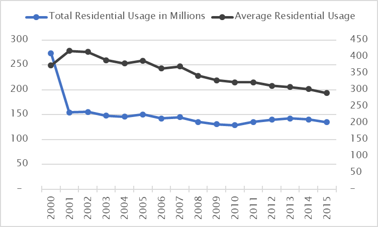 Figure 1: Total and Average Residential Water Usage Broken Down by Year
The figure below shows the range of average water usage values across all wards for 2001 and 2015. In both years, average water usage varies drastically; average water usage can be anywhere between 0 and 232 percent higher than another ward depending on the wards chosen for comparison.
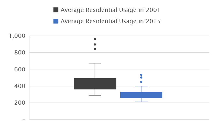 Figure 2: Average Residential Usage by City Ward
Geospatial Analysis
This dataset is also an exciting opportunity to play with R’s geospatial mapping libraries. So I set off to download shape-file information from the city of Toronto website and start playing around with the data. The results of my geospatial work can be found below.
The six pairs of figures below compare, by community region and ward: average water usage, and percentage of total water usage for 2001 and 2015. I thought it might be interesting to start at a more aggregated community level and then zoom into the ward level to see where the changes in water usage are occurring.
The figures below seem to indicate that average water usage across the city appears to be declining; however, water usage within the Toronto and East York region is higher compared to the other three regions for 2001 and 2015.
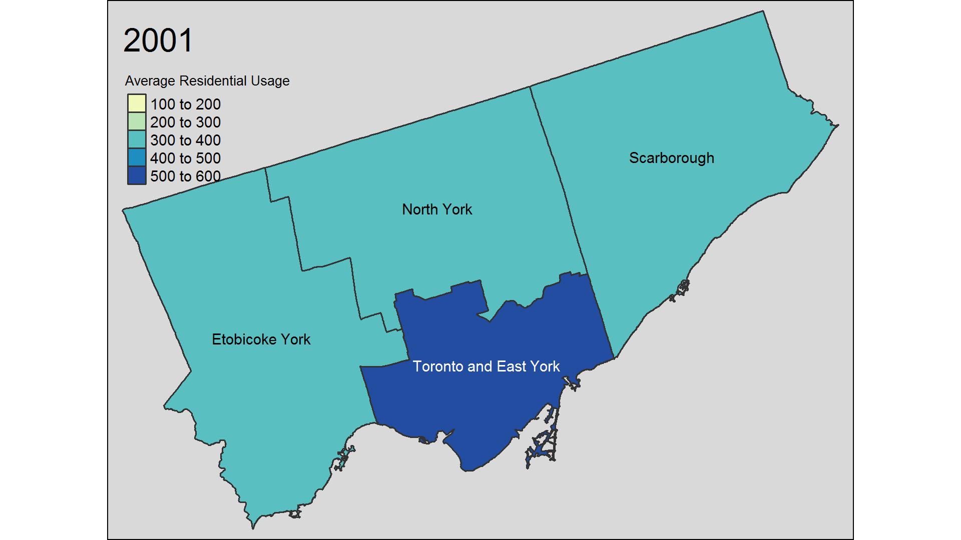
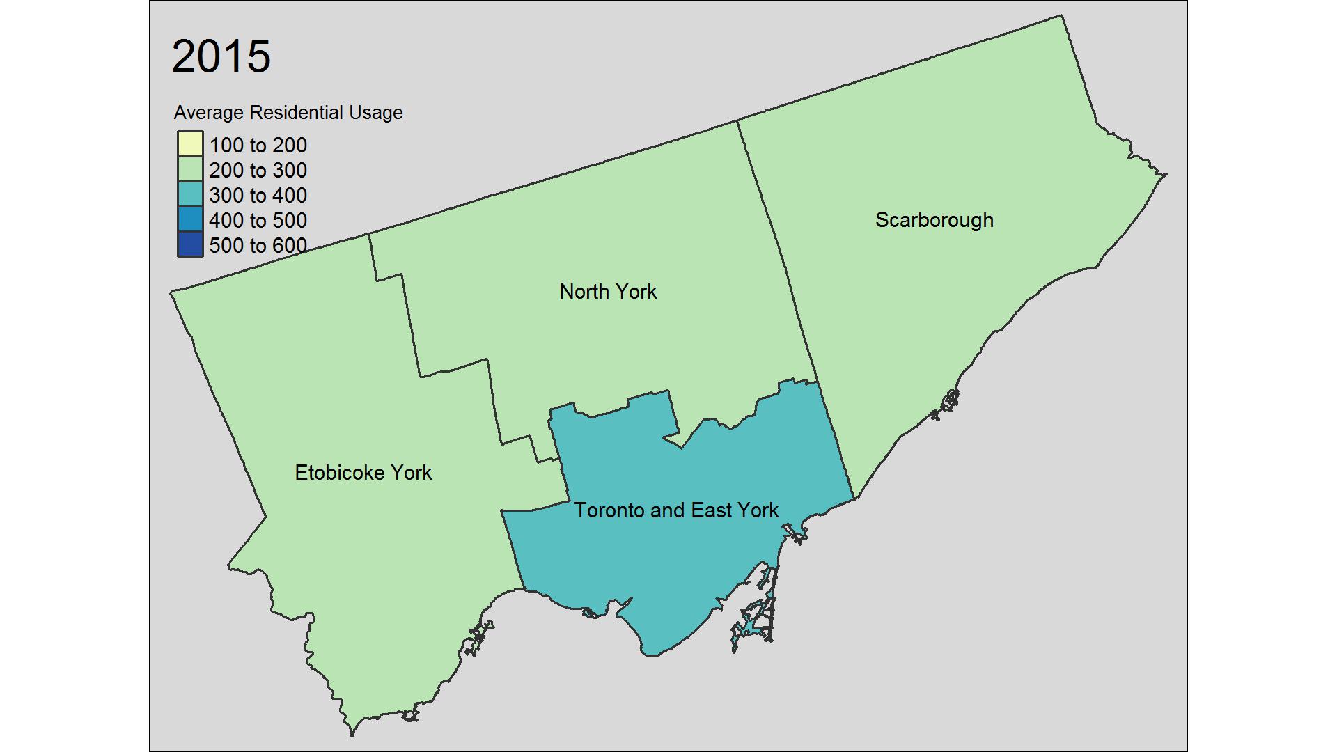 Figure 3: Average Residential Water Usage by Community Region
Disaggregating by city ward allows us to get a better sense of where these changes are occuring.
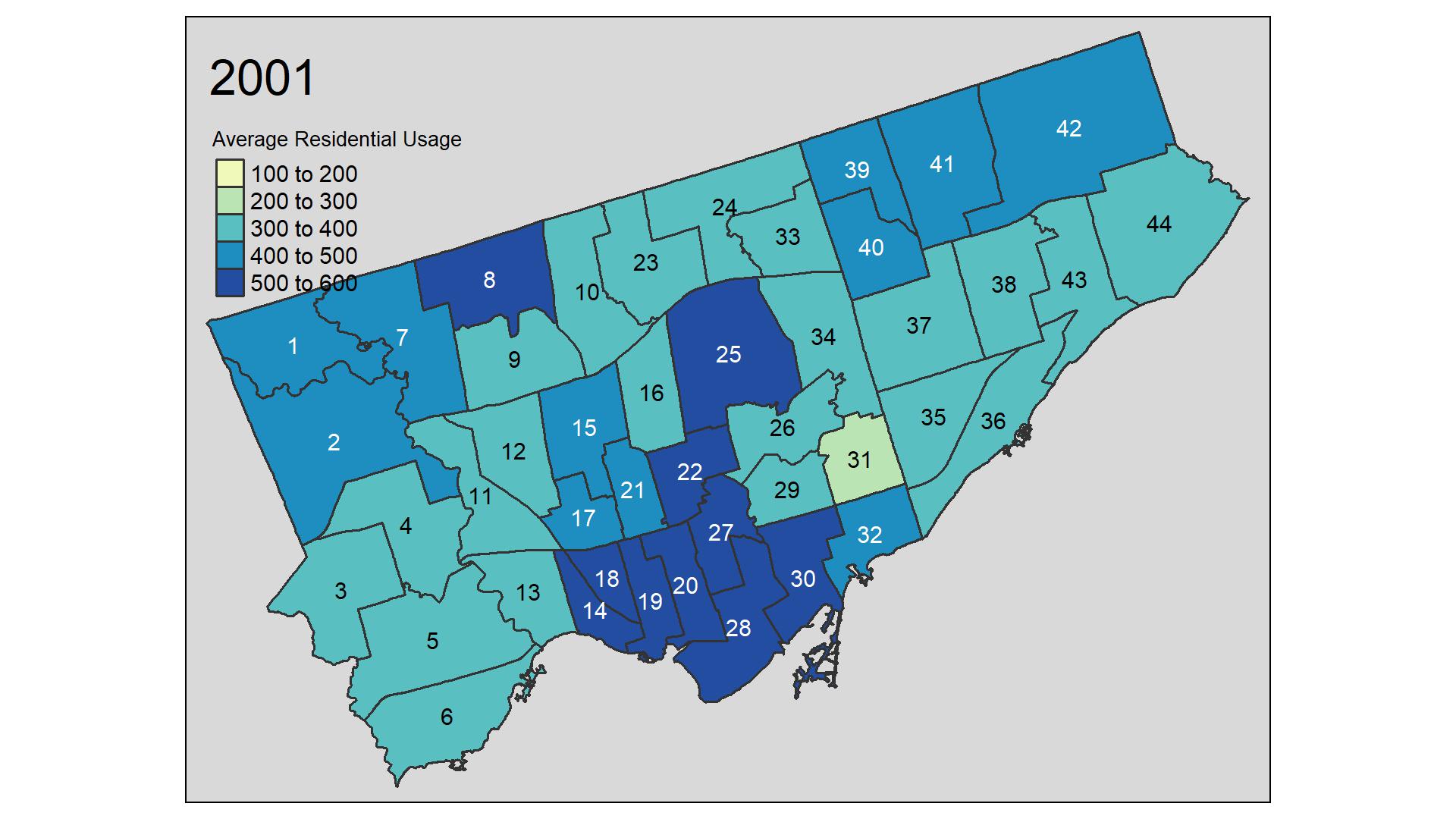
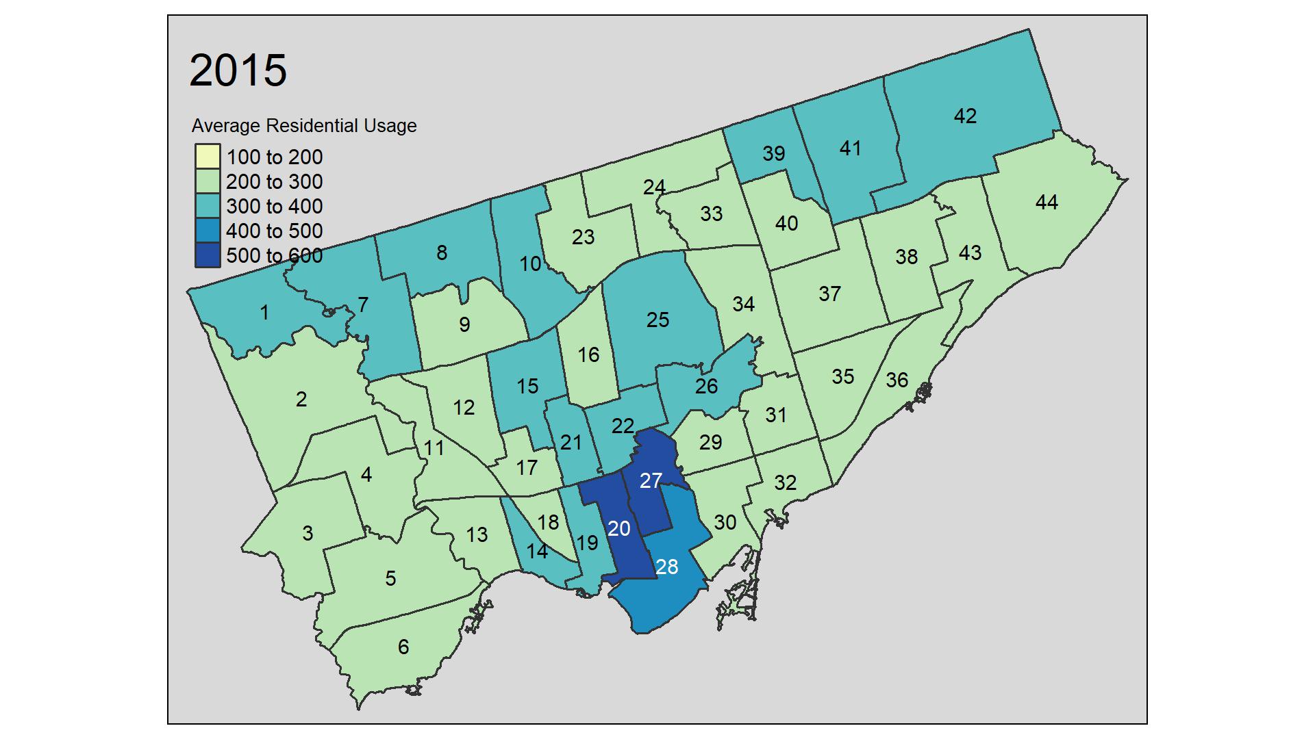 Figure 4: Average Residential Water Usage by City Ward
Total water usage in Toronto appears to have shifted from Etobicoke York and Scarborough to Toronto and East York from 2001 to 2015; however, this change is not obvious looking at the information at the city ward level.
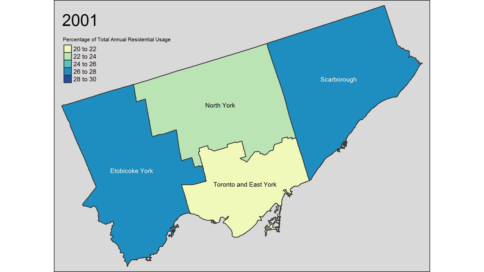
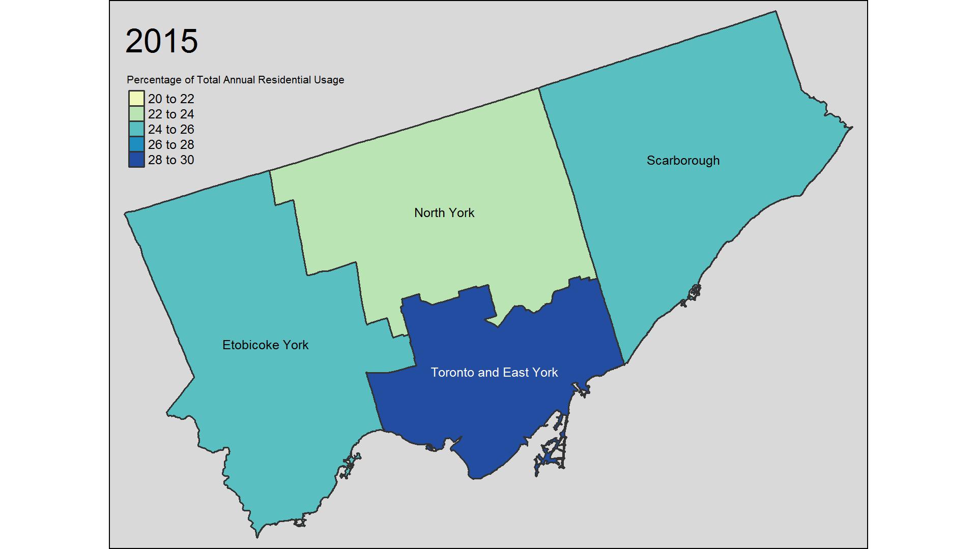 Figure 5: Percentage of Total Residential Water Usage by Community Region
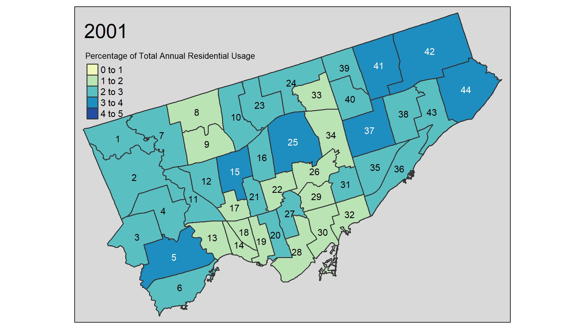
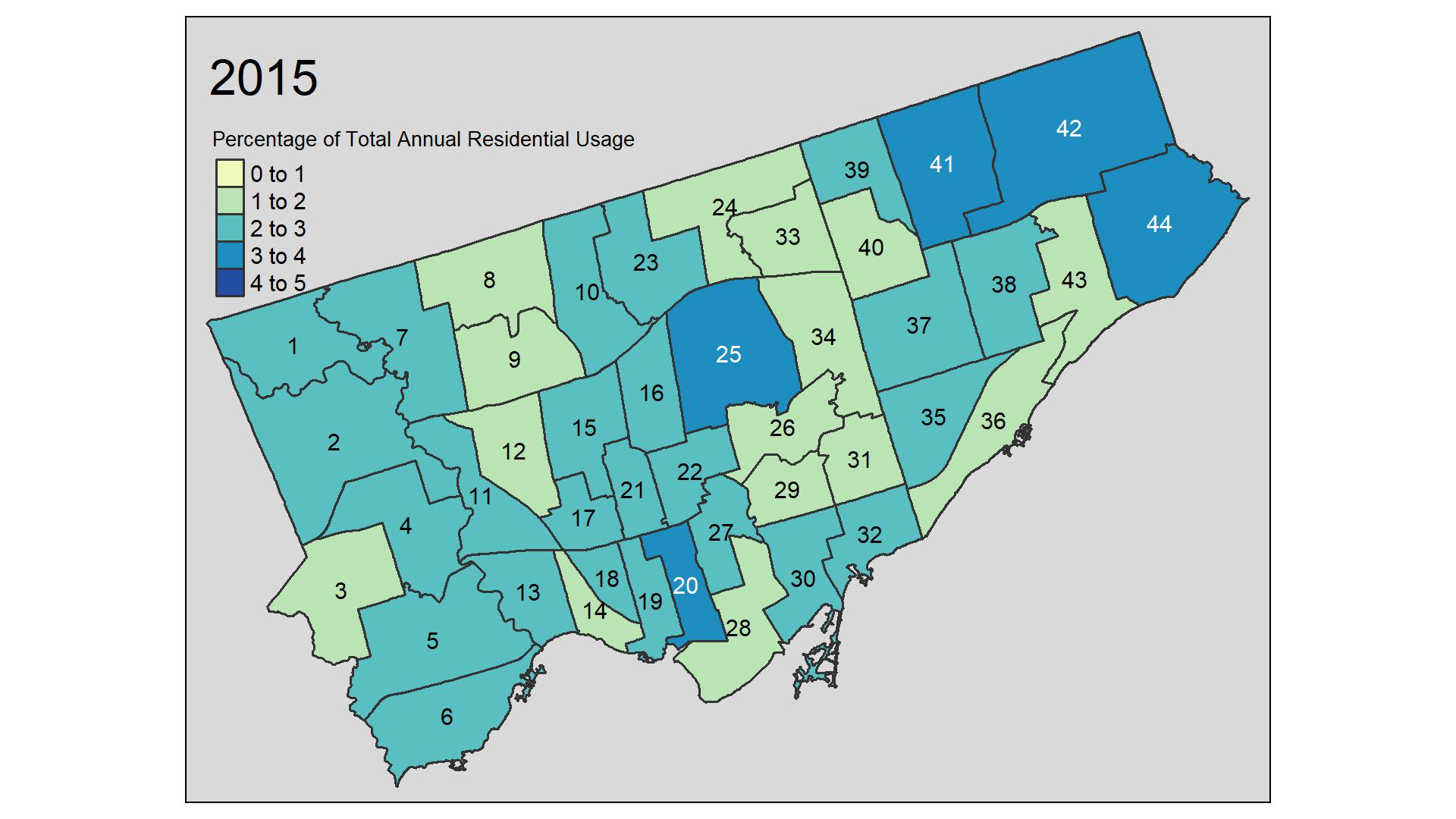 Figure 6: Percentage of Total Residential Water Usage by Community Region
Conclusion
That’s it, all done! Hope you enjoyed this post. It’s been a while since I have been able to post anything and I’m happy I had some time work through this and hopefully provide some insight into water usage throughout the city.